
This post offers a brief explanation of a work in progress: an interactive visualization of the abnormally high number of US deaths that took place during the pandemic, but which were attributed to causes other than COVID-19.
The data is updated weekly, and can be viewed here: https://covid-excess-nchs.herokuapp.com/
From the early days of the COVID-19 outbreak, the Centers for Disease Control and Prevention, through the National Council for Health Statistics, has been publishing and updating, on a weekly basis, datasets that are intended to give a fuller picture of the impact of the pandemic.
There are some excellent publications that make rigorous use of this data to show that many, many more people have died in the US during the pandemic than official COVID death tolls account for:
- July 1, 2020: Estimation of Excess Deaths Associated With the COVID-19 Pandemic in the United States, March to May 2020 (and an excellent codebase here: https://weinbergerlab.github.io/excess_pi_covid/)
- December 16, 2020: All-Cause Excess Mortality and COVID-19-Related Mortality Among US Adults Aged 25-44 Years, March-July 2020
- December 17, 2020: COVID-19 as the Leading Cause of Death in the United States
The CDC's own data dashboard is quite powerful as well, and contains good cross-tabs: https://www.cdc.gov/nchs/nvss/vsrr/covid19/excess_deaths.htm
However, these datasets have not received as much press or play in popular “data journalism” interactives. This is perhaps because data visualization interface design is generally biased towards giving users a sense of control and certainty, and this data highlights our uncertainty about the pandemic’s death toll.
As a part of my work in the Center for Research Computing, and informed by my work for the Medical Humanities, I have been experimenting with ways of making this data interactive, explanatory, and clear about its uncertainty:
The data it draws on is here: https://data.cdc.gov/NCHS/Weekly-counts-of-death-by-jurisdiction-and-cause-o/u6jv-9ijr/
And the code running the app is here: https://github.com/JohnMulligan/covid_dashR/
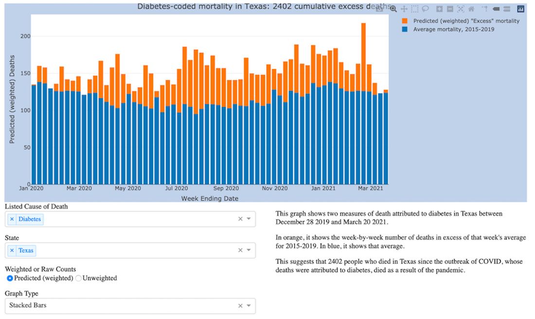
This visualization app allows you to select
- One or more imputed causes of death (which were selected by the CDC because they appeared on death certificates frequently alongside COVID)
- One or more states
If it has enough data to work with in those selections, it then graphs, for those selected states and attributed causes of death:
- The pre-COVID weekly averages since 2015
- The number of deaths above that average since COVID
There are more rigorous ways of estimating excess mortality using this data. But I developed this visualization because everyone knows what an average is (not everyone knows what a confidence interval is), and because there are some very interesting state-by-state and regional trends to be unpacked here.
This data visualization raises important questions for researchers and the public going forward:
- What counts as “excess” mortality in a post-COVID world, and how might we reevaluate our past normalizations of mortality in general?
- If some forms of medical care have been provided at low or no cost during the pandemic, then should we withdraw those protections if the problem is larger and longer-term than previously recognized?
- How do public health reporting mechanisms feed into public health as such? What, and who, “counts” according to our current frameworks, and is this acceptable?
Contact John Mulligan, PhD with questions (or suggestions for improvement of course!) at jcm10 [at] rice.edu.